Quilt Festival never ceases to amaze, and this year was no exception. The breadth of artistic style and technical prowess on display are endlessly impressive and inspiring. Here are a few (ok, A LOT — just settle in right now) of my favorites from this year’s show!
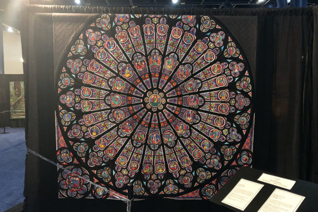
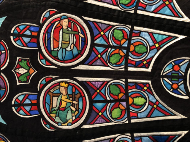
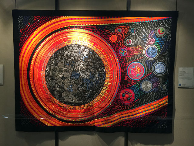
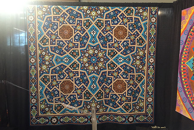
This quilt was an interpretation of the rose window at Notre Dame in Paris and was absolutely breathtaking. Silk fabrics added a lot of vibrant color and allllll those little black lines were pieces of fabric as far as I could tell. Amazing.
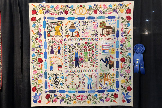
This was the winner in the Small Applique category, and was made to honor the quilter’s 25th wedding anniversary. Each block showed something important to their relationship. It was so cool and meaningful!
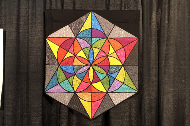
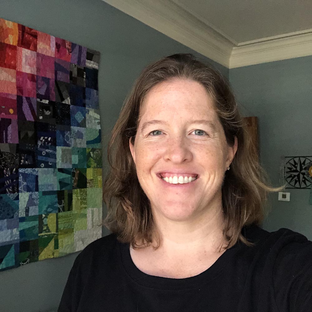
Ummm I can’t forget my quilt, right? It’s still a thrill to look back at these photos and remind myself that my quilt was actually there!
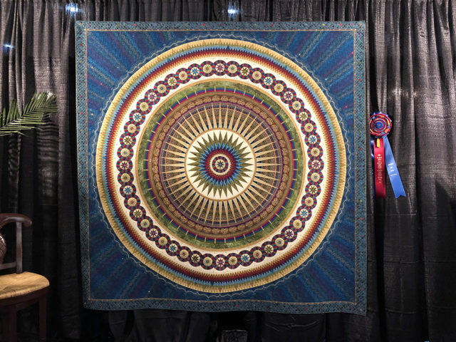
This was this year’s Best in Show winner and it was truly stunning. The quilt is dedicated to the quilter’s mother, and took 5,000 hours and 15,000 pieces to make. Jaw dropping.
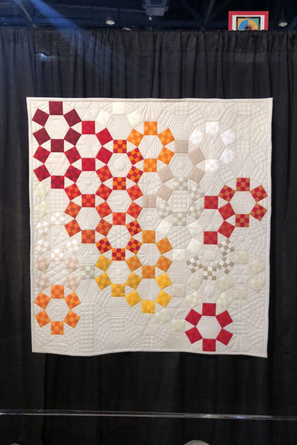
Unchained Melody by Jackie Benedetti, quilted by Dionne Matthies-Buban 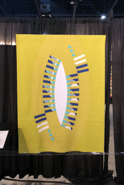
Felicitous Pickle by Kelly Spell 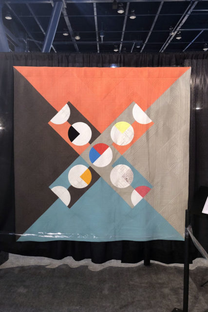
Give and Take by Kari Vojtechovsky, quilted by Christine Perrigo
The Modern Quilt Guild had its annual showcase and the three above were my favorites in that area. (I’ve usually seen quite a few of the quilts in this exhibit before the show on Instagram or elsewhere, so these three were also new to me.)
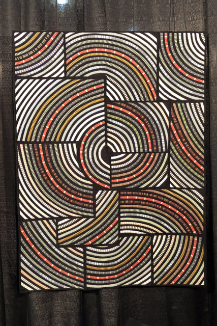
Voyage en Orbite by Gabrielle Paquin 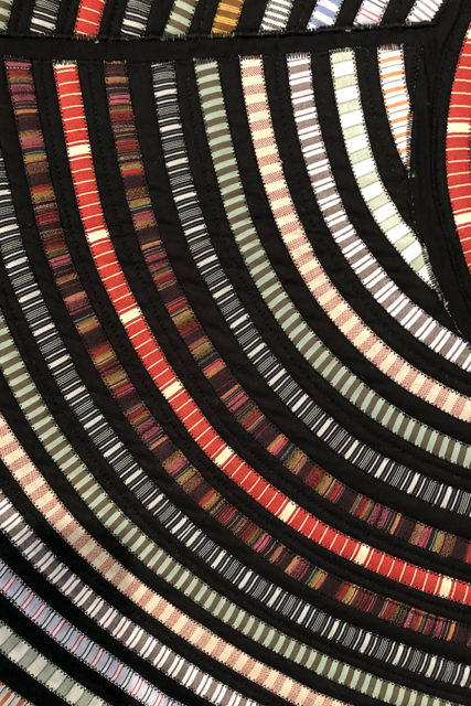
Voyage en Orbite detail
I was drawn in by the lines and bold blocks of this quilt, and fascinated by the applique technique and endless variety of stripes.
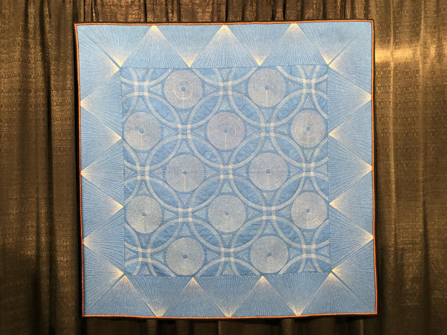
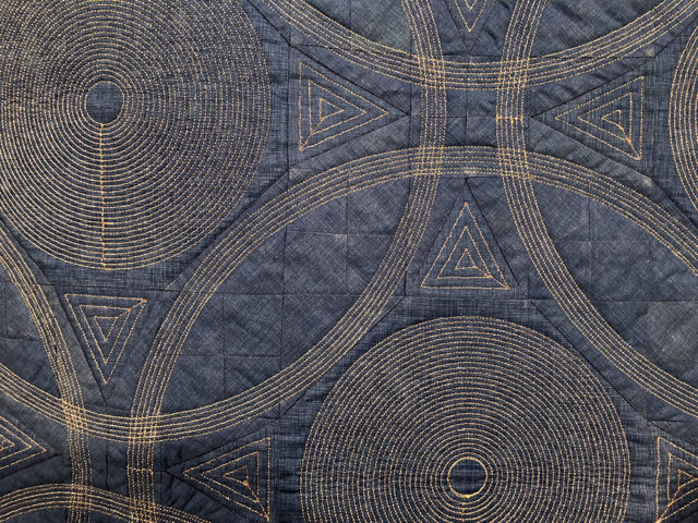
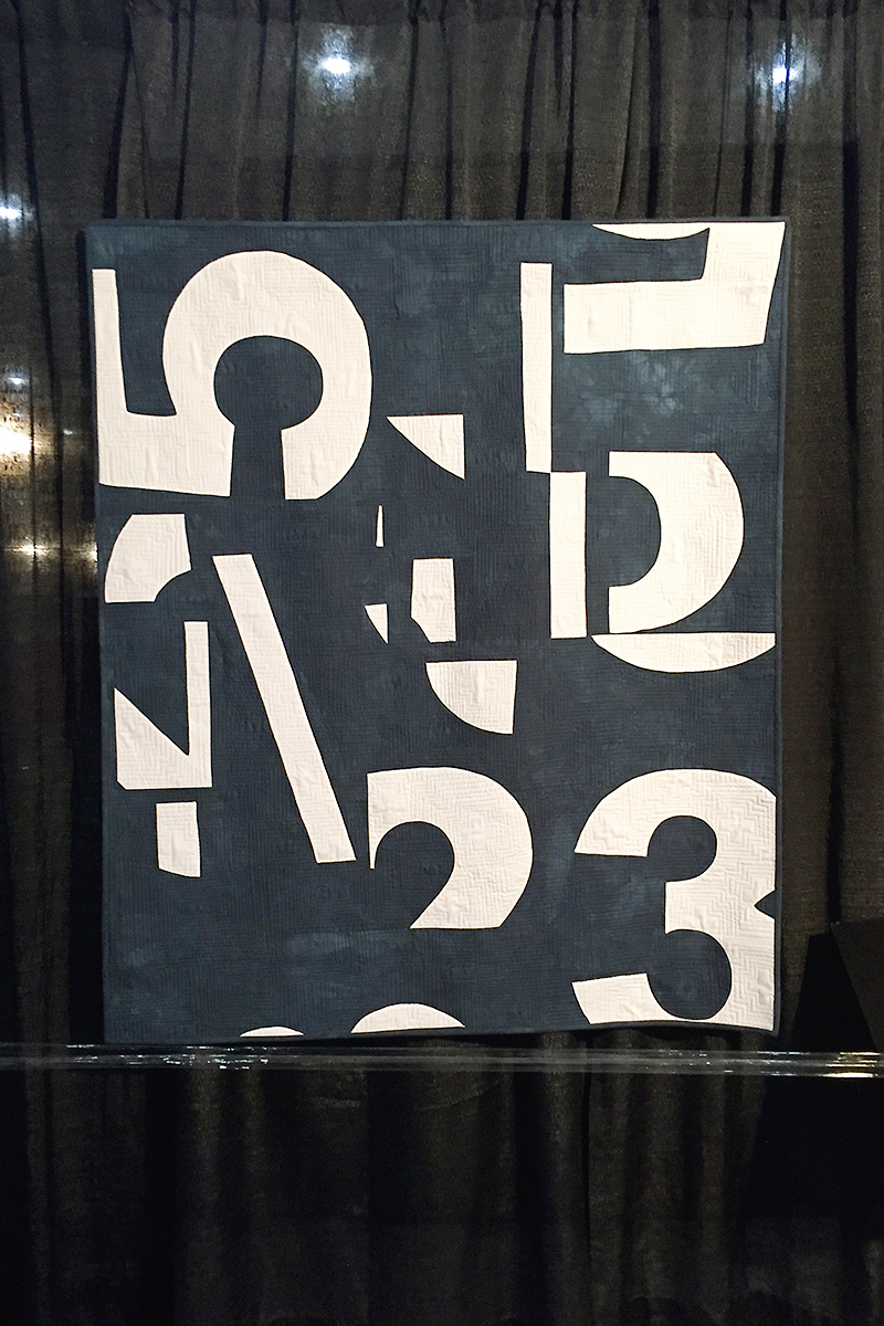
This is the first quilt this quilter ever made from start to finish. Um, can we just stop by think about how crazy that is? The top is pieced, but all from the same fabric — Burkett changed the direction of the pieces to provide slight variations in color and texture.
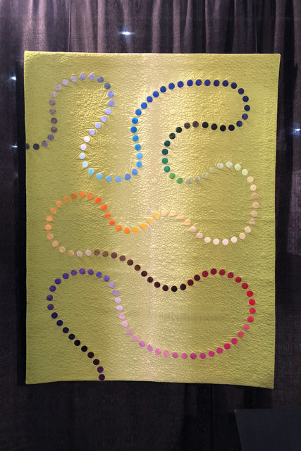
No Return by Anne Lillholm 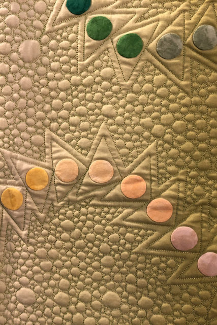
No Return detail
This quilt was both simple and complex — a best of both worlds combination!
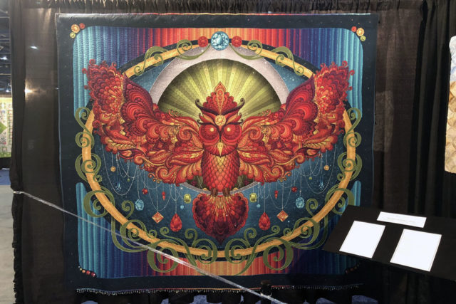
I follow Karlee, but she had only given sneak peeks of this quilt before the show. As soon as I saw it though, I knew it was hers. The fabric is digitally printed from her artwork, and the quilting and beading is just phenomenal.
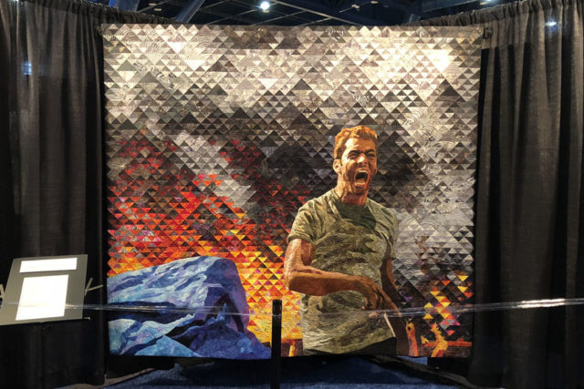
This quilt was both beautiful and really powerful in its imagery. It was based on a photograph by Mosa’ab Elshamy taken during the Rabaa Square Massacre in Cairo in 2013.
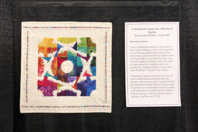
The piece of paper with the quilt information isn’t much bigger than a standard 8.5×11 sheet, so hopefully that’s all you need to know to appreciate the extreme tiny piecing going on here. Wow.
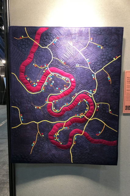
Blue Remembered Hills by Alicia Merrett 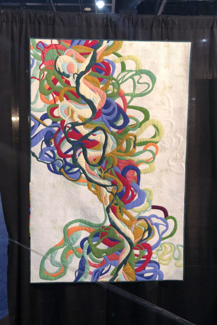
Mississippi Meander by Timna Tarr
Have I ever mentioned how much I love map quilts? I LOVE MAP QUILTS and someday soon I will make one of my own. The one on the right is based on a map showing how the path of the Mississippi River has shifted over time. (I’m signed up for a class with Timna Tarr at QuiltCon in February and I’m SO excited about it.)
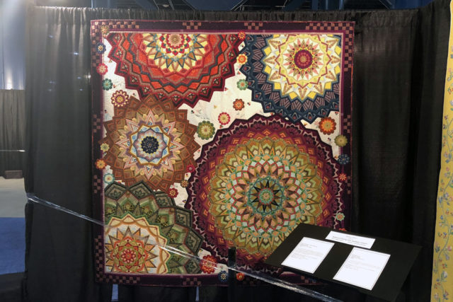
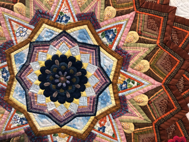
This flower/mandala design was really beautiful and layered, and made from kimono and futon fabrics. There was a lot of hand piecing and hand quilting, which also gave a lot of texture.
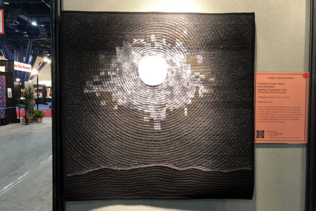
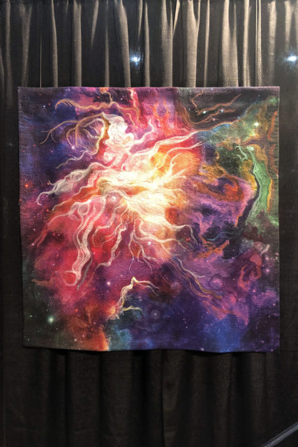
The Orion Nebula by Robin Hart 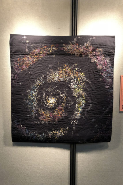
Galaxy 6 by Dolores Miller
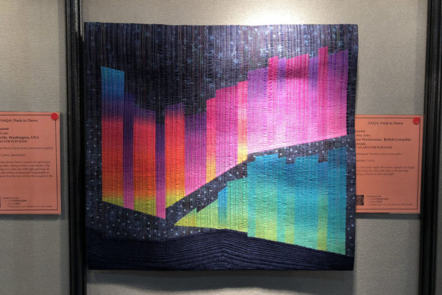
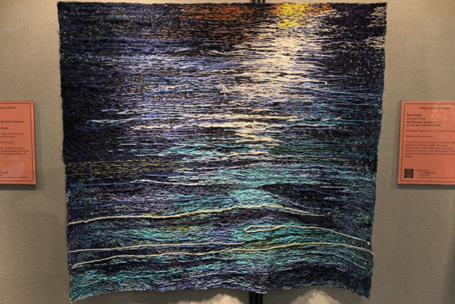
I always come across several space-themed designs and of course I’m a huge sucker for that subject matter! I loved all four of these but The Orion Nebula by Robin Hart was a definite favorite. It’s a wholecloth design, and all the imagery is created with fabric paints, dyes, and thread. Wow. The other four were all part of a really lovely SAQA exhibit called “Dusk to Dawn.”
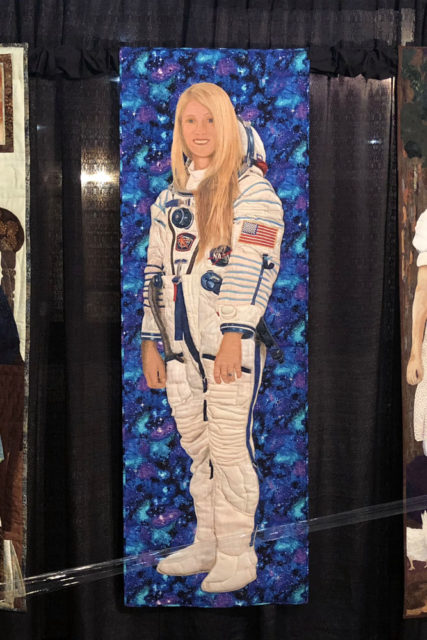
This quilt of astronaut Karen Nyberg was made for the Power of Women exhibit by a woman who lives in the Houston area. I rather fortuitously ended up sitting next to Judy Beskow, the quilter, at dinner on the Friday night of Quilt Market, the week before the show and we had a lovely chat about quilting and NASA. It was great to then find it in the show!
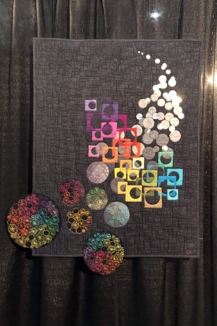
This began from leftovers of a mini quilt. If only all my leftovers could turn into something this amazing…
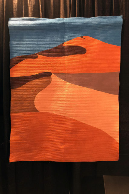
Voyage en Namibie by Brigitte Didier 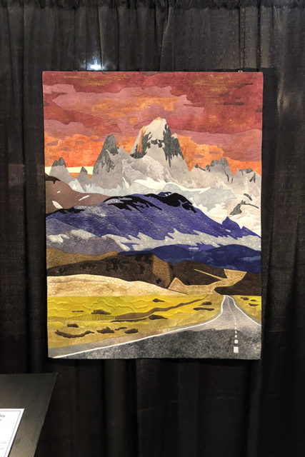
Mount Fitz Roy by Rita Dijkstra
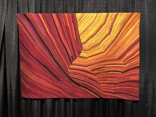
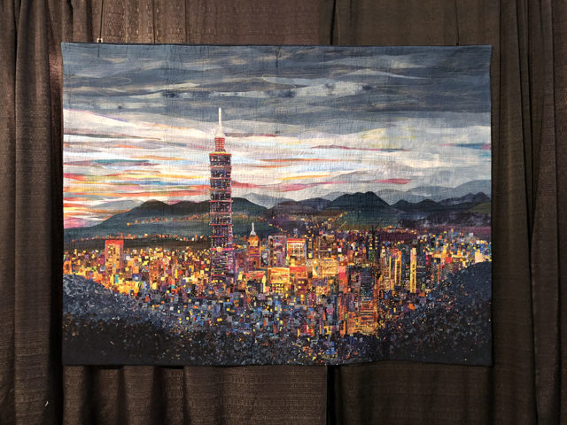
There are always quite a few stunning landscape quilts, and these were four that really caught my eye for various reasons. See Taiwan was wonderfully detailed and felt like it was glowing. Mount Fitz Roy reminded me fondly of my own trip to Patagonia a decade ago. And the other two had me marveling at how graphic you can be with only a few shapes or colors.
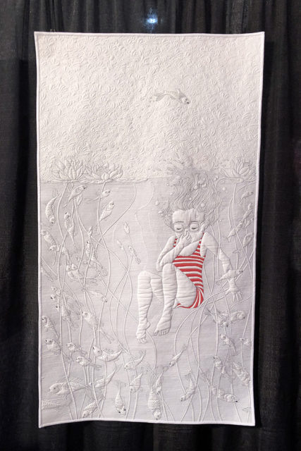
I loved both the detail and the subtlety of this quilt, where the image was created almost entirely by the quilting.
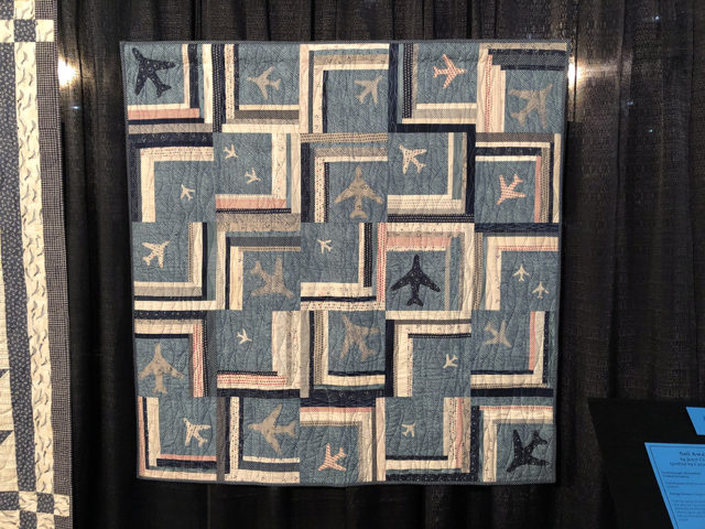
I loved this quilt for the airplanes alone, but it was also part of a larger exhibit of quilts by Janet Clare. Each featured the same general color palette, which was interesting!
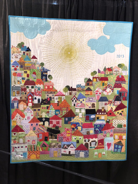
I love this whole idea so much: “Every December we wrap up the year with a celebratory breakfast that I host for all my students. It’s a really fun party. To have a memento of that wonderful day, I asked the students to bring a little house for me from which I would build a quilt. It’s fascinating how everybody’s personality comes out in their piece.”
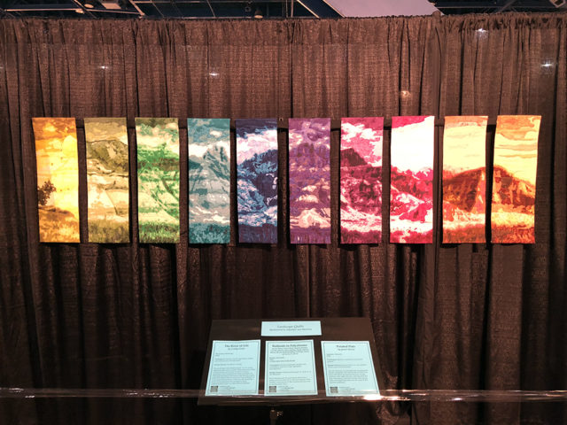
This was a group quilt and I loved the premise — dividing a panoramic photo into 10 sections, assigning a color to each person, and having them turn their section into part of the larger quilt.
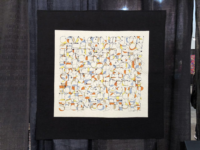
This design was inspired by listening to lively music. I’m not sure if those are letters or not, but they look like it to me, although I can’t make out any part of the message if there is one!
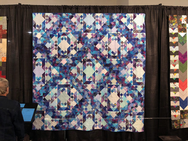
Scrap quilts are a dime a dozen, but that doesn’t mean they can’t still be downright gorgeous.
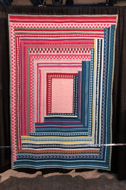
The contrast between pink and blue was really striking in this quilt. It was made using the “Seminole technique” which I’d never heard of. It’s named from the Seminole tribe, and from what I can tell it is a version of the general process where you strip piece, cut, and then piece back together again.
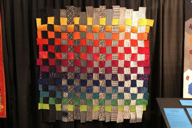
This quilt was unlike any I’d seen before, featuring wobbly strips of fabric that were woven together. It had great texture in person!
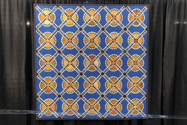
Last but certainly not least is this very traditional pattern that makes heavy use of a mustard color that I tend to dislike, and yet I came back to this quilt a couple times to look at it again because it just seemed to vibrate with energy.
That, to me, is Quilt Festival in a nutshell. There is so much work on display that I might think unappealing or simply not my style if described, that when seen in person is just amazing. Can’t wait for next year!
p.s. I’m doing a 31 day blog writing challenge!
