I first came across Skillshare via an ad on Facebook — and it turns out to be the one and only time thus far that Facebook ads have shown me anything I actually wanted to buy. The whole concept behind the site is that it allows people with SKILLS to SHARE them with others (hence the name, obviously) in a friendly, no pressure environment. I’ve taken three courses now and am partway through two others, and each have been related to skills I’m using or developing as I work on my master’s project. So while they don’t know I exist, I’ve been enjoying the site enough that I wanted to write about them anyway. Here’s what I like so far:
- Every course is project-based. This means that in addition to learning new skills, you’re given a way to immediately put them to use by doing a project — creating an illustration, for instance.
- The courses are short and sweet. Although you can put as much time as you want/need into the project, the course videos are brief and to-the-point. I finished one course in only a few hours. In some cases, short would be bad, but in this case I really like it. I can feel confident that I’m going to learn a few new things without having to commit a lot of time (that I don’t have).
- They’re cheap — an average cost of $20 per course is my rough estimate. At that price, I don’t have to hem and haw and worry about whether the content will truly be worth the price, because $20 isn’t that much. (Plus, there are sales and coupons that make them even cheaper. I took advantage of a Cyber Monday sale last week!)
As for the specific courses I’ve done, here are my thoughts so far:
1. Digital Illustration: Communicate with Color, Pattern and Texture
I learned how to use Illustrator in the first graphic design class I took at UHCL back in 2005, and I love love love it. But for my master’s project, I wanted to incorporate some techniques — specifically with patterns and textures — that I haven’t done before, and I wasn’t sure where to start so I decided to give this course a try. It’s taught by Brad Woodard of Brave the Woods. Fortuitously, I realized after signing up that he is one of the artists behind a great space alphabet poster I bookmarked months ago — which confirmed that I liked his style, and made me even more hopeful that the course would be good. I was really pleased with the overall experience. The course was divided up into several different lessons, each with 3-5 video lessons that averaged about 10-15 minutes in length. It turned out to be a great way to learn a few new Illustrator skills, and I enjoyed the format so much that I immediately signed up for another of Brad’s courses.
For my project for this course, I worked one of my master’s project posters that I’ll be posting here next week.
2. Learn the Ins and Outs of Illustrator
This was the second course, and if you take both while learning Illustrator, this is really the one to do first. (I did them backwards. Oh well!) It covered several things I already know how to do, but as it turns out, a refresher is always helpful — I picked up some tips and tricks for using basic tools that I hadn’t thought of before. The project was to recreate an illustration or vintage ad, so I chose this Explore the Universe poster by Moustafa Khamis. (I didn’t actually finish my recreation completely since I never added gradients and texture, but those would have taken more time, and I need to be spending that time on my master’s project pieces instead.)
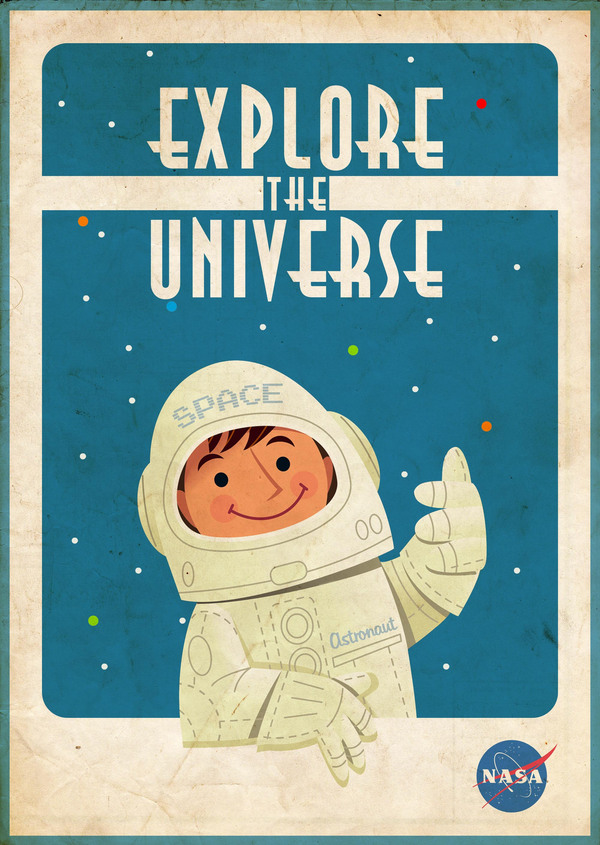
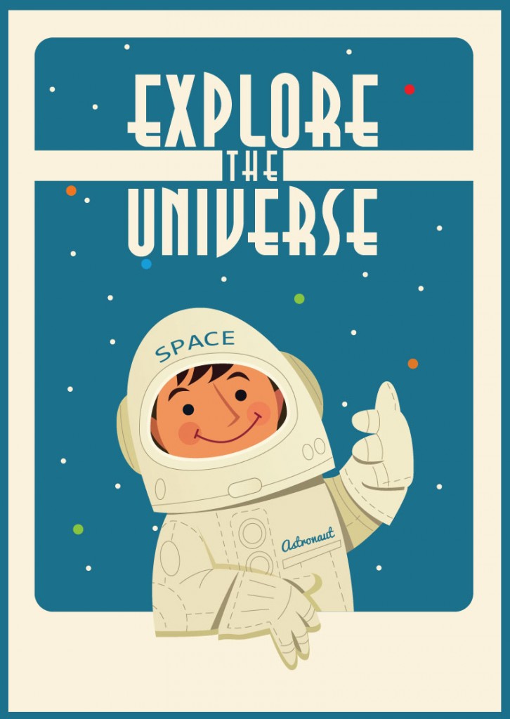
Original on left, my partly-finished copy on right
3. Introduction to Photoshop: Fundamentals for Beginners
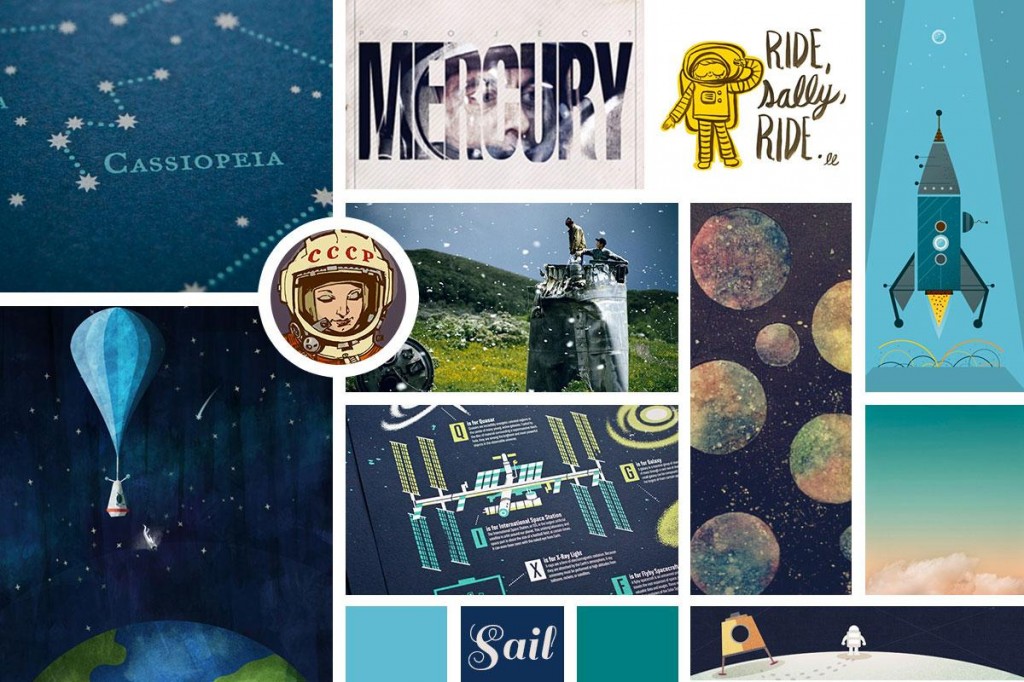
I’m entirely self-taught at using Photoshop, and as a result, there are a lot of basic things that I really am not quite sure how to use properly. This course was VERY basic — perhaps too basic even for me — but it did contain a few useful nuggets and I liked the instructor’s teaching style. The project was to create a mood board, so I made this one full of cool space art that I’ve pinned in the last few years to serve as further inspiration for my posters.
4. The First Steps of Hand-Lettering: Concept to Sketch (Lettering I)
5. Digitizing Hand Lettering: From Sketch to Vector (Lettering II)
I’m working my way through both of these right now. I had originally signed up for the second one, without realizing it was part of a series. When I noticed that, I went back and signed up for the one too. I’m hand-lettering the titles for some of my posters, and I’ve always been interested in hand-lettering in general, so I’m enjoying both of these. They are taught by two different people so it’s also neat to get different perspectives.
After I’m done with these two, and after I’m done with my master’s project, I have a whole wish list full of other little courses to take to teach me more about web design and other fun things!
