A couple weeks ago, I mentioned that I was working on my first photo book! It’s hard to believe that I’ve been snap-happy for all these years and have never actually had anything printed into a book, but it’s true. Obviously I have been missing the boat, because now I want to make photo books for basically everything I’ve ever done.
I think my hang up has always been that I want the photos themselves to be perfect, and if they’re not perfect, what good was making a book? But painstakingly editing every single photo takes time and let’s face it — a lot of the time, the photo as is it good enough. (That saying about better being the enemy of good? Totally applies in this situation.)
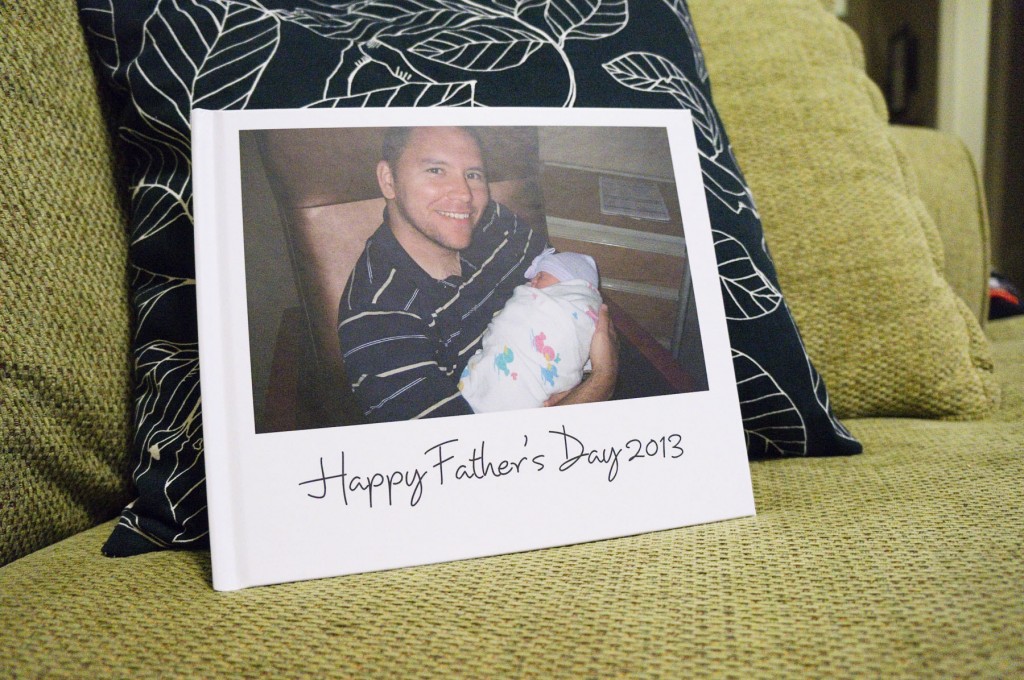
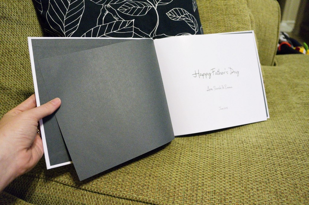
So I finally made a book! Inspired by the awesome photo book Jose made me for Mother’s Day full of pictures I hadn’t seen because they were on his phone, I decided to return the favor. I have tons of photos of him with Emma that he never saw because they were on my camera or my phone. Now we have two books full of awesome memories. Win!
I decided to go with Blurb because I’ve heard good things about them. One of my favorite things was how many different options they seem to have. You can choose from several different types of books in many different sizes, with different options for covers and paper quality. I also love the different levels of “interactiveness” you can have with your book — all the way from simply uploading your photos and letting them fill an automatic layout to designing your book entirely in InDesign and printing it from a PDF file.
I was really tempted to design my own book in InDesign but I managed to talk myself out of it since I knew that would take WAY too long. I took the middle-of-the-road option instead and downloaded the BookSmart software. It was easy enough to use, although a lot of the default layouts were too busy for my tastes. I wanted something simple and straightforward, so I ended up fiddling with some of their provided layouts until I had ~10 of my own to use throughout. The software let me save my own customized layouts, which was really nice. Once the layout was selected for each page, it was easy to drag-and-drop each photo where I wanted.
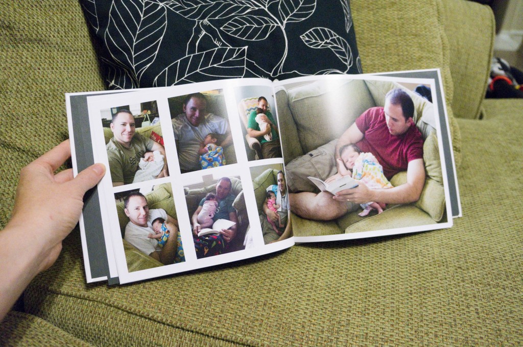
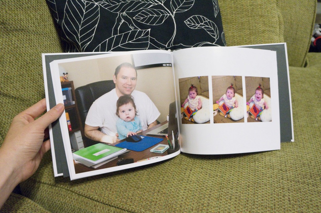
One of my favorite spreads in the whole book — Emma asleep on Daddy!
Another positive is that it’s pretty easy to find coupon codes to use with Blurb. I joined their email list months ago and so when a Father’s Day 25% off coupon arrived in my inbox, I figured it was a sign to finally try them out. I made a 10×8″ 52-page book with upgrades to include an ImageWrap Hardcover, Premium Lustre paper and ProLine endsheets. Then I used the 25% off coupon, and had to splurge on faster-than-standard shipping (since I procrastinated too long to meet the Father’s Day standard shipping deadline). The total for all that was $47. I’m sure I could have produced this book for less by going through some of the cheaper sources, but this seemed like a good balance between price and quality to me.
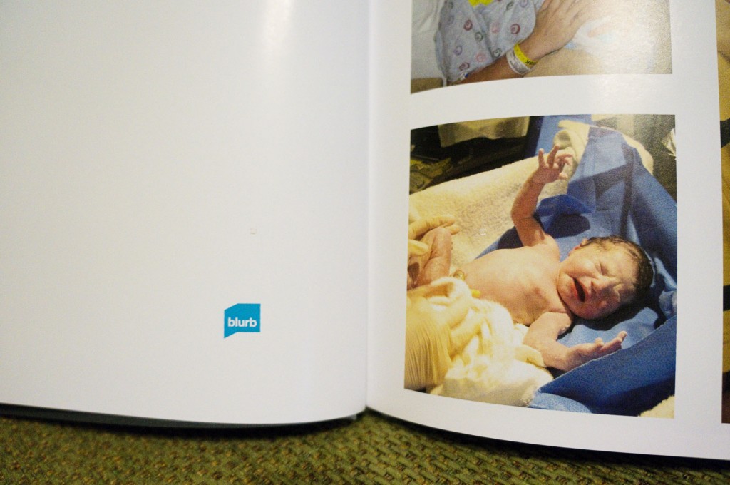
One minor negative to mention is that the Blurb logo is always included — both on one of the first pages, as seen earlier in this post, and on the very last page. You can get rid of it or replace it with your own logo by paying 25% more, but that wasn’t worth it to me this time.
But the biggest negative I’ve discovered with Blurb is that they don’t have the option of making a book with “lay-flat” pages. Because of that, I won’t be using Blurb for our wedding album since for that project, I really want the sleek, professional look that lay-flat pages help provide. (I’ve decided to use Adorama.) But for projects like this Father’s Day album, I know I’ll be using Blurb again.
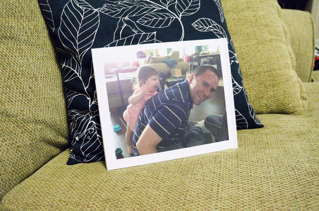
The back cover also features a cute daddy/daughter photo!
Overall I was really happy with the way the book turned out! I probably spent 2-3 hours doing the layout (and that’s totally because I’m a control freak, so you could probably do it a lot faster) and the result is a pretty awesome little book.



I used Blurb for my wedding album, and I had many of the same thoughts as you.
I actually spent a ton of time on it. I used Booksmart, but I created jpegs in photoshop that were full layouts of various photos, and I had some multi-page layouts. Anyway, for a service so “upmarket” and expensive (before coupons) as Blurb, the lack of lay-flat is annoying. I also didn’t think the quality was really any better than Shutterfly. I got a great coupon also (~$30 for a 12×12 book), so I really couldn’t complain, but I just am really used to Shutterfly for casual books, so I’ve stuck with them since.
Shutterfly now has a lay-flat option, but it’s VERY expensive and excluded from all their coupon offers, so I haven’t tried it.
I was also going to mention that Shutterfly had the lay-flat option, for an additional charge (of course). I’ve done books of the kids for each set of Grandparents each year…they take me countless hours to complete, which might be why I’ve never even made one for me or the family! I am also very OCD about the layouts, the formatting, the pictures, etc. I did create one for Joseph for Father’s Day with all his IMTX pics, though.
I was great at doing an annual photobook for Cassie, annually. It was a great gift for family. Sadly though I’m now 4 years behind. *sigh*. BTW, I also did my own wedding album — it wound up being a 5 year anniversary gift!