Some people meticulously plan how they are going to decorate their house. Jose and I are not those people.
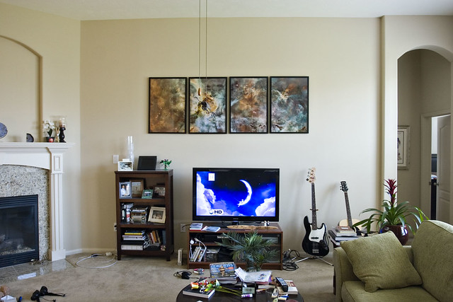
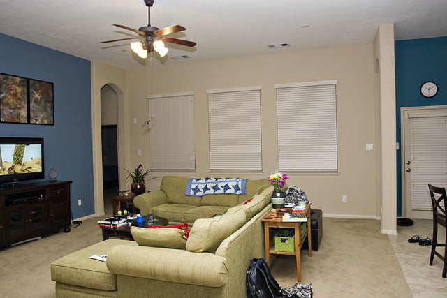
Sometime last week — Wednesday, maybe? — Jose said “hey, let’s do something to the house this weekend.” It sounded like a good enough idea to me and within an hour or so, we’d decided to paint a big portion of the living room wall. Here’s what it looked like before (although this is a very old picture; we replaced that tiny Ikea TV console with a much nicer console last year):
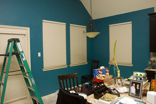
The whole room was just very beige. Beige carpet, beige tile, beige trim, beige wall. Even our wall art over the fireplace is beige! We went back and forth on colors and tried out a few using old paint samples we had. We both liked one of the samples called blue sash…but I was a bit hesitant. Our breakfast room, if you recall, is a very dark teal/turquoise:
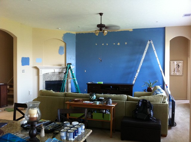
I was worried that a medium blue and a dark teal would be too much. But as Jose reminded me — it’s just paint. And there’s still be a lot of beige separating the two areas. So we went for it. We painted the entire area between the arch to our bedroom and the arch to the front door. Both arches come out a few inches from the rest of the wall, so they provided a natural place to start and stop. Our ceilings are 11 feet tall. The green ladder next to the fireplace is a standard 6-foot stepladder, so the big metal extension ladder we bought a while ago has turned out to be quite a good purchase.
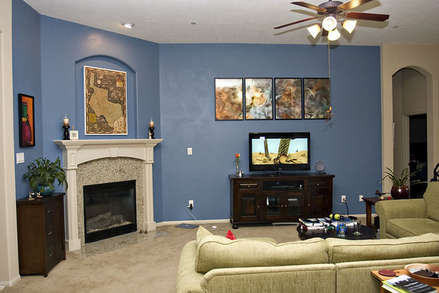
And…drumroll please…here’s how it turned out! Although I was hesitant at first, I really like it. The colors are probably bright for a lot of people, but we are fans of color. And worst case is just that we paint it back someday when we sell the house.
I took these photos at night so the room looks a bit dark. It looks better during the day. We don’t have enough lighting in this room, especially now that the wall is dark. I haven’t figured out how to fix that yet, since most of our furniture floats in the middle where there are no outlets, so I can’t put lamps on the tables. There is also a bit of weird shininess/splotchiness going on with the paint so we may end up doing a second coat.
We’ve had a medium-sized bookcase to the left of the TV since we moved into the house, which you can see up in the first picture. I like it because it provides some shelf space to store and display things, but I don’t like how it makes things look off-kilter. We haven’t moved the bookcase back yet because I wanted to see how I felt looking at the room without it…and I’m still undecided. With the bookcase, the wall feels too heavy on the left side. Without the bookcase, that space between the TV and fireplace looks way too bare. Maybe some kind of shelving that’s more open than a bookcase? An ottoman? A tall plant? If you have suggestions, I’d love to hear them.
I took this final photo just to show the contrast between the blue on the left and the teal on the right. I love both colors and while they’d look strange if they were right next to each other, I think they look fine with the huge wall of windows between them. If anything, the window wall now looks bare! I’ve thought about making some window treatments but I’m afraid curtains might look too old-fashioned or something. I don’t know. The jury’s still out. So heck, I’ll take suggestions on that too.



break that wall up with chair rail (molding) and then just put a very simple designed wallpaper. It wont be overbearing with paint and you wont have to worry about contrasting colors. I would just go with something beige-ish with simple pinstripes or something like that.
I would’ve done wallpaper a long time ago…if our walls weren’t textured. But every. single. freaking. wall. in the entire house has a light texture on it, so the entire wall would have to be sanded or plastered or something to make it wallpaper-friendly.
That is one big thing I would do if we ever build a house again — ask them NOT to texture the walls.
Not possible in Houston, the walls have to be textured. You would see all the bowing and seems in your dry wall without texture, its just an inevitable result of the combination of concrete slabs, cheap construction methods, and moisture in the air.
Oh come on, there’s no way that’s true. There are tons of places with wallpaper in Houston that look lovely.
Now, the builder would probably balk at not texturing for various reasons. But wallpaper not possible because of concrete slabs and humidity? No way.
For the book shelf solution, you could get yourself a a longer, 3ft high book shelf to double as a sofa table for behind the couch, or just find a sofa table that will work for books. On the window treatments, you might be able to do cornice boxes (I’ve made them). You could find a fabric that compliments and/or ties in both colors some how. They’re real easy to make. I can send you a picture, if you’re interested. I kept my blinds and used the cornices — I used sheers merely as an accessories, and they really just hang between each window (I have 4 across in my living room).
I’ve thought about that too — and sure, I’d love to see a photo!
That looks great! I like the bold color you picked. It really makes the art stand out in a good way.
I agree, like the colors. I agree that a simple cornice would be nice on the windows — something to tie the colors together. Use those great new sewing skills 🙂
So, having a wall of windows myself, I’ve given this about 10 years of thoughts and I have yet to see someone put drapes on walls of windows that I like – I surfed the internet for pictures and never found an example I liked either. I think the answer is “fancy blinds” – either plantation shades or, I think the way we’ll go (if we ever get around to it) is the fabric shades with the blinds between the two layers of fabric. I also like Karen’s idea of a cornice, I just haven’t found one modern enough for our house styles, but I also think that would work.
Fabric shades with blinds between the layers? I can’t picture those. Do they fit inside the “box” of the window or do they hang outside?
They fit inside the window box, I think they are called filtering shades. This is the set I’d pick out for myself: http://www.hunterdouglas.com/our-products-detail.jsp?id=1
There are a lot of varieties, some are fabric only, some have a honeycomb, and some have horizontal shades between the fabric, I like that the best.
The effect on the room is like this:
http://css2psd.com/2009/12/02/sheer-shades-for-elegant-and-versatile-window-treatments/
http://www.blindsaver.com/Bali/Top-Down-Bottom-Up/b_o.dox
I like the idea of fancy blinds as well.
Wallpaper is possible, no problem, does the same thing as textture in terms of hiding dry walls flaws. Getting builder not to texture is not possible because then buyer would see all flaws in the construction of the dry wall. Clearly in my era of house building (90s) wallpaper must have come free cause so many houses have it. But if you remove it, it just unfinished dry wall below.
I always vote for plants — a big plant between TV and fireplace!!