Last night Jose and I took our first run from the new house! It felt unexpectedly strange to be running in a neighborhood, after running for so many years on the trail at work or along the busy roads near my apartment complex. It was also hot as crap outside. I can deal with the heat well enough — at a minimum, I accept it — but Jose was pretty miserable since he doesn’t run as often as I do. We’re going to look into joining the YMCA down the road so that we have close access to treadmills and elliptical machines — not to mention a lap swimming pool for me!
I spent the rest of the night making dinner, which is SO MUCH MORE PLEASANT now that we have a giant kitchen, and putting some of our paint samples on the walls. We’ve been thinking of a nice light blue for the kitchen and breakfast room, so we picked out a nice sky blue called “sailboat.” On the walls, however, it’s too bright, or too neon-y or something. I love bright colors, but even I’m not crazy about it. So we tried the darker blue sample that we’d gotten with the intention of using in the dining room, but I find it a bit too dark. Maybe I’ll hit up Lowe’s tonight for something in the middle.

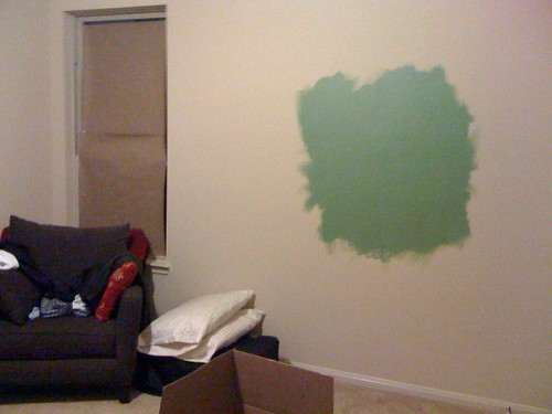
On the other hand, the “cactus shadow” color that we picked for the master bedroom looked very nice as a big splotch on the wall. It’s still a little hard to picture what it will look like when the whole room is painted, but I think it will be good.

If you have any suggestions of paint treatments you’ve seen, I’m all ears. Our biggest question is what to do with the kitchen/breakfast room/family room/dining room area, since the spaces all flow together and therefore need to complement each other.
In the picture above you can see how the kitchen and breakfast room are really one big area. Here you can see how the kitchen and dining room are both very visible from the family room:

And here you can see how the family room is visible from the breakfast room:

I’m having trouble thinking outside the box! Last night we started pondering using a light-to-medium gray in the dining room, which might allow for a cool, colorful rug…


My grandma used a benjamin moore color called “jamestown blue” in one of her rooms. It was a lot like that but had more grey in it I think, which toned down the brightness a little. I loved the color and am still trying to think of a way to use it in my house. That might be an option.
I also suggest you stick to neutral colors in the transition areas between the rooms. and using one color scheme from one paint company will probably solve the “matching” issues in adjoining rooms.
Another thought.. prime your walls before you paint. Yes, I know the builders painted once already and theoretically primed. But based on the experience I’ve heard of people painting new homes, builder primer is fairly cheap and the first layer always soaks into the dry wall anyway. A good primed layer will make the paint you do put on look a LOT better. You can prime with white, or you can tint the primer with whatever color you are painting the wall, that will make it “pop” a little more.
I’m no help with colors…our walls are a slightly darker tan color than the standard builder colors and the dining room came painted Sage. The only room with color is the kiddo’s! Sad!
I like the builder’s beige or some coordinating neutral in the kitchen / breakfast room.
Don’t be afraid of wallpaper; there are ton of really awesome prints available. It will take a few coats of paint to cover the walls in a new place so do your weight lifting. http://www.colourlovers.com/ is full of inspiration.
I like the sky blue, but that might be the photo. It’s really hard to tell paint colors from photos.
What I’d do for the dining room would be to go out and find a rug you like that looks good with the blue from the kitchen, and then match the dining paint to another color in the rug or a neutral that sets it off. It’s easier to match the paint in that situation than the rug, I think. You could also do a brighter color under the chair rail and something more neutral over it.
You could also do an accent wall in a contrasting color in the living room – maybe by the fireplace, or even inside the art niche if the whole wall seems like too much.
Anon, our entire house is beige. I want less beige.
Danielle, I love the idea of wallpaper — however, all of our walls are textured, so they’d need work just to be ready for wallpaper. I’m not sure I want to do that.
Jen, we’ve considered doing the fireplace wall as an accent. The idea of just the niche is interesting too.
Since you have high ceilings like we do, I would also offer up the idea of doing two tones. We did it in our bedroom and it made all the difference. Also some of the paint stores have these little brochures which include complementary colors — some neutral some more punch.
http://picasaweb.google.com/phiAE01/NewPaintForBedrooms?authkey=Gv1sRgCKCtvuev47769gE#5325040702823552626
Nice, with textured walls you could do a wash and it will add more depth. I always like hot pink, think that would work well with the blue? Kidding.