I took two classes this semester at UHCL to finish up all my class requirements for my Master’s in Digital Media Studies. I still have to do the final project, which is a 500-hour requirement, but I expect to officially graduate in December. One of the classes I took was quite possibly the worst class I have ever taken in my 10 years of post-secondary education. But as of yesterday, it. is. OVER.
The other class is much more enjoyable. Our final project, due later this week, is to create a cover for Free Press Houston, a local alternative newspaper with a circulation of about 65,000. They publish twice a month with a focus on arts, entertainment, music and events. Their website says they are “locally owned by people from Houston who hate people from Dallas and Austin.” So you get the picture.
Our assignment parameters were pretty simple: “Think about your life’s mission. Think about the social and political issues that have formed your identity. Using your deepest motivations, create a cover for the magazine ‘Free Press Houston.’ The covers designs will be jurried by the Design Staff at Free Press Houston, and the winning cover design will appear on a summer 2009 issue.”
There are only 8 people in my class, so I figure my chances are pretty good. Before I talk about the details, here is the cover I’ve created.
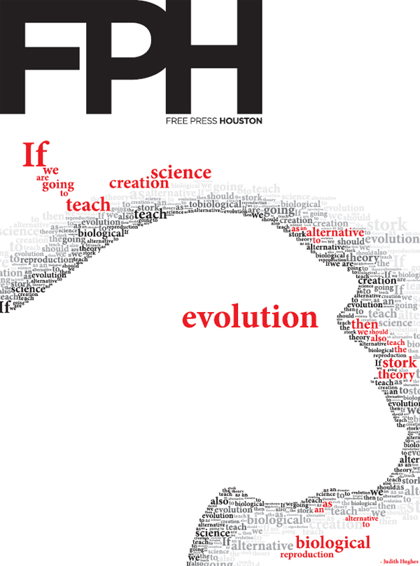
I ended up going with a theme that Jose and I talk about a lot, thanks to his immense interest in biological and medican science and our shared interest in science in general. There’s been a lot of debate in Texas over the past year or so about teaching evolution in schools. Of course the issue is far more complicated than I could ever summarize in a single paragraph, but basically there is large and vocal group who believes evolution should be taught as only one “weak” theory of how life came to be, and that creationism and/or intelligent design should be given equal weight. And this idea came very close to being passed by the Texas State Board of Education.
Now I don’t want to start a debate, but suffice it to say that I believe evolution has significant scientific footing, and that creationism does not have a place in public schools.
ANYWAY, the real point of this blog is solicit some constructive criticism — not of the theme but of the design — since I am really hoping to win this class contest and have my work published. Can you tell what the image is? Can you read the quote? (Keep in mind that printed size would be 10″ x 13.5″ so it’s understandably harder to read on a screen.) Do you like the way it looks? Is it eye-catching?
If you have thoughts, let me know.

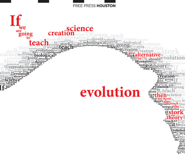

The quote took me a while to read.. eventually I got it. But the stuff on the far right about the stork is hard to spot at first glance – and I wouldn’t have even finished looking unless you mentioned there was a quote. And I’m not sure about the phrase “creation science”, not really a science, right? So anyway, to me, science stood out as a separate word appart from the rest of the quote.
I could tell what the picture was, but maybe only because that’s what I was expecting it to be..
This is excellent work (coming from someone who has actually won awards for layout design long before it was done on a computer). The only comment I would have outside of how well this is put together is “stork theory” almost gets lost (Obviously I am not viewing it actual size). That said, depending on your message (or your “bias” if you will) this may have been intentional and I can clearly see why you would do that. This is really impressive!
Yeah, I was also worried that the words on the right get lost — and it’s not just because this is a reduced size version. So I think some tweaking is in order on that part.
Thanks for the kudos Jamoosh!
Love it! I agree it did take me a sec to get the entire quote read. And love the outline of the ape. Very creative!
Becca, I get what you’re saying about the “science” part of the quote…but it’s a quote, so I can’t really change it.
I agree with what everyone else said about making the “stork” part pop out a little more. It looks awesome!!!
You lose “evolution” on the right since it’s not in red. Actually, I finally see it in the center. Somehow, I’d move it so it flows a little better. I honestly looked 3 times and didn’t see the word “evolution.”
The way creation science or whatever is stacked is not optimal. Like Becca, I was a little confused. I think if you just put them adjacent, rather than vertical, it’d be more clear. Right now, it almost reads “science creation” rather than “creation science.” I’m also a little confused of what the outline is – a stork? a turtle?
Ah – I see someone else’s comment. It’s an ape! Maybe add some very faint gray detail to make that more obvious? Or not. 😉
Overall, it’s very eyecatching and a very cool idea.
Hey, I’m in your PR Writing class. YOu should upload a higher-res so we can see the details. I didn’t get at first to read from the top then to the bottom. The typography style is really captivating and so is your concept. I fully agree with the concept and your views of the Texas debate.
As a fellow graphic designer I would suggest moving the main “evolution” up a bit (if you haven’t turned it in yet) because I had a bit of a prob reading the statement in its chronilogical entirety. That could be because it’s small on my screen. Either way, good job, awesome concept, and I hope you win!
BTW, What class is this for? And what is the one you refer to that you disliked!?
Becca, creation science is the term (along with intelligent design) commonly used as an alternative to natural evolution. The main principle being that some aspects of biology are irreducibly complex and cannot be explained through gradual change. It is the center piece “evolution alternative” in the public policy debates about science education.
If it obviously seems to not be science… tell it to the Texas State Board of education who thinks students should be taught to “analyze and evaluate the sufficiency or insufficiency of natural selection to explain the complexity of the cell.”
I had a bit of trouble with the ape outline as well. Maybe a more pronounced forehead? Or some gray wording outlining an ear?
Very, very good. Yes, it takes a little bit to figure out, but it’s not too hard and that’s good. It makes it an experience for the viewer, and something they remember.
That’s pretty amazing. I saw the ape outline immediately after reading creation science at the top. Like others have said, it’s a little difficult to read at the posted resolution and I stopped reading after creation science and then skipped to the big evolution at the bottom since I figured that was the gist of the wording. As others have suggested making the first evolution on the right in the quote in red font to help the cohesiveness.
Overall, very, very impressive.
“Now I don’t want to start a debate, but suffice it to say that I believe evolution has significant scientific footing, and that creationism does not have a place in public schools.”
It doesn’t sound like anyone is debating so I hope I’m safe in expressing my opinion/beliefs. I copied your quote above just so I wouldn’t have to keep scrolling up.
You believe that evolution has significant scientific footing and should be taught in school. I believe that intelligent design has significant scientific footing and should also be taught in school. Why can’t both be taught?
That’s the thing I don’t understand. It’s two differences of opinion – belief systems – scientific data. No human being was present when the universe began so both viewpoints are theory. So why only teach one viewpoint?
I hope my comments are well-received. Just speaking freely…I don’t want to argue either. Thanks.
This is Pony, by the way…in case it doesn’t say who posted this…I had to click on “post anonymously” but then my name came up so maybe it worked.
I really like it! I could see the shape right away, before I started reading the words or your post telling me it was for an assignment. The colors catch my eye. I wish “as an” was a little closer to “alternative to” but other than that, it all looks fantastic.
I hope you win!
you probably don’t need any more feedback but here it is!
– I thought it was a dino at first, but quickly figured out it was an ape
– I also didn’t find the word evolution at first. when I found it, I found it first in the grey text to the right of “as an alternative to” and wondered why it wasn’t red. then finally I saw it in the middle.
other than that, this rocks.
-cg