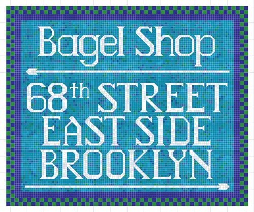
Typography class ended last night with presentations of the fonts that we spent all semester designing. I ended up happy with my font, though I must admit that it is not the most useful of all fonts. It was inspired by a photo in one of our textbooks showing snippets of the sign for a Noah’s New York Bagels shop. See how the sign is really a mosaic and the letters are made of tiles?
After doing a quick search on the net and not immediately finding a similar font, I decided to make a mosaic font. Mine’s called Bagel Shop, and here’s the poster I made to show what it looks like. Obviously mosaic letters also reminded me of the subway.
I still want to do a bit more work on it, not with the letters themselves but with the spacing. Even without that, it’s usable right now.

It turned out better than I expected.


